Mama Pops
Brand Identity
Role
Graphic Designer
Brief
Mama Pops wants to develop a brand identity that is minimalistic, modern, and fun. The target audience are adults. The store sells organic snacks. Popcorn is the top selling product.
Concept
I used simple geometric letter forms to create the wordmark. Considering the leading food that our client Mama Pops sells is popcorn, so I added a little popcorn above the title to create a movement, to emphasize their most famous product.
Seahorse Fitness
Brand Identity
Role
Graphic Designer
Brief
This is a swimming fitness center. The client wishes the new logo to include a seahorse and display typeface. The concept is to be children friendly.
Concept
The client requested us to incorporate a seahorse as the main character for the logo. For the font choice, we picked the one that has a similar design as the shape of the seahorse’s tail and overlapped it with the graphic, so they blended seamlessly.
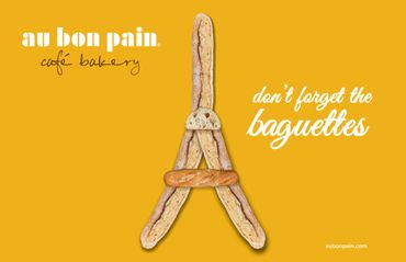
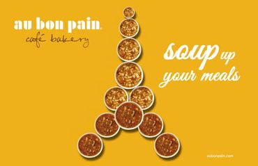
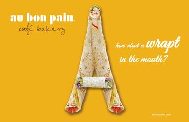
Au Bon Pain
Advertising Design
Role
Graphic Designer
Brief
Client requirement: Design a poster that can emphasize their French originated flavored food
Concept
Their top selling products are designed into the shape of Eiffel tower, the famous landmark of France. Color palette is based on their store interior design. For the type design, we are using a handwriting font to deliver the scent of French Romanticism
NYC
Road Rage PSA
Role
Graphic Designer
Brief
The New York state department wants an public service announcement that reminds and hopes to reduce the occurrence of road rage
Concept
According to my research on people with road rage, they often raise their middle finger to insult other drivers. Most of the time they can’t realize how evil they may look when doing those actions. Therefore, I designed a series of PSAs aiming to reflect road rager’s appearance and remind them how ugly they are. I’m using a bright neon red type with a middle finger cross through the letter to get viewers’ attention while displaying the appearance of road ragers’.